Driving growth with a scalable loyalty program
How can we strengthen customer loyalty at a rebranded logistics company?

Facilitated cross-functional teams to build a scalable loyalty initiative that is adaptable to various markets for GoGoX, Hong Kong's first tech unicorn that went public (IPO) in 2022.
🚀 Launched on both iOS & Android.
💪🏼 Increased the retention rate by 4%.
Problem
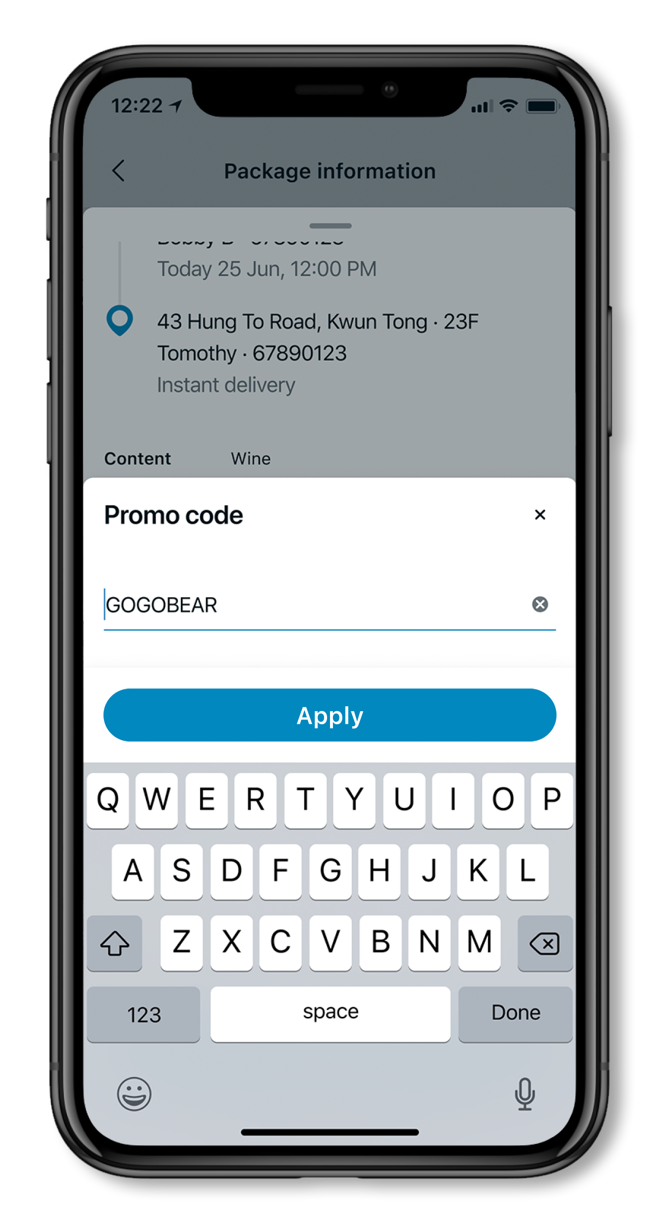
Current promo code system is inefficient & limited. Due to services expansion, the marketing team approached us to enhance it to reach more customers.
Current system only allows marketers to launch promotions to a small group of users and does not notify users about them. Given our premium pricing, we hypothesised that this might be why we're losing customers.
Thus, we asked:
How might we help customers feel more inclined to stay or come back to our platform?
SPOILERS! Sneak peek of the final solution
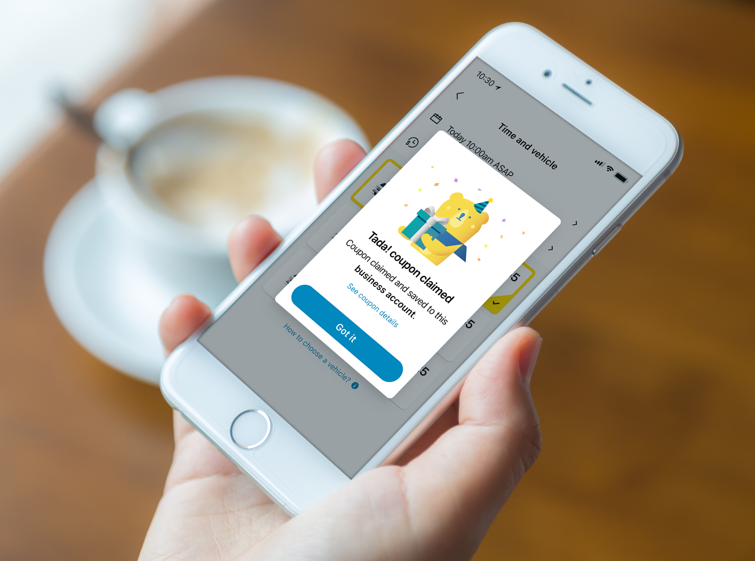
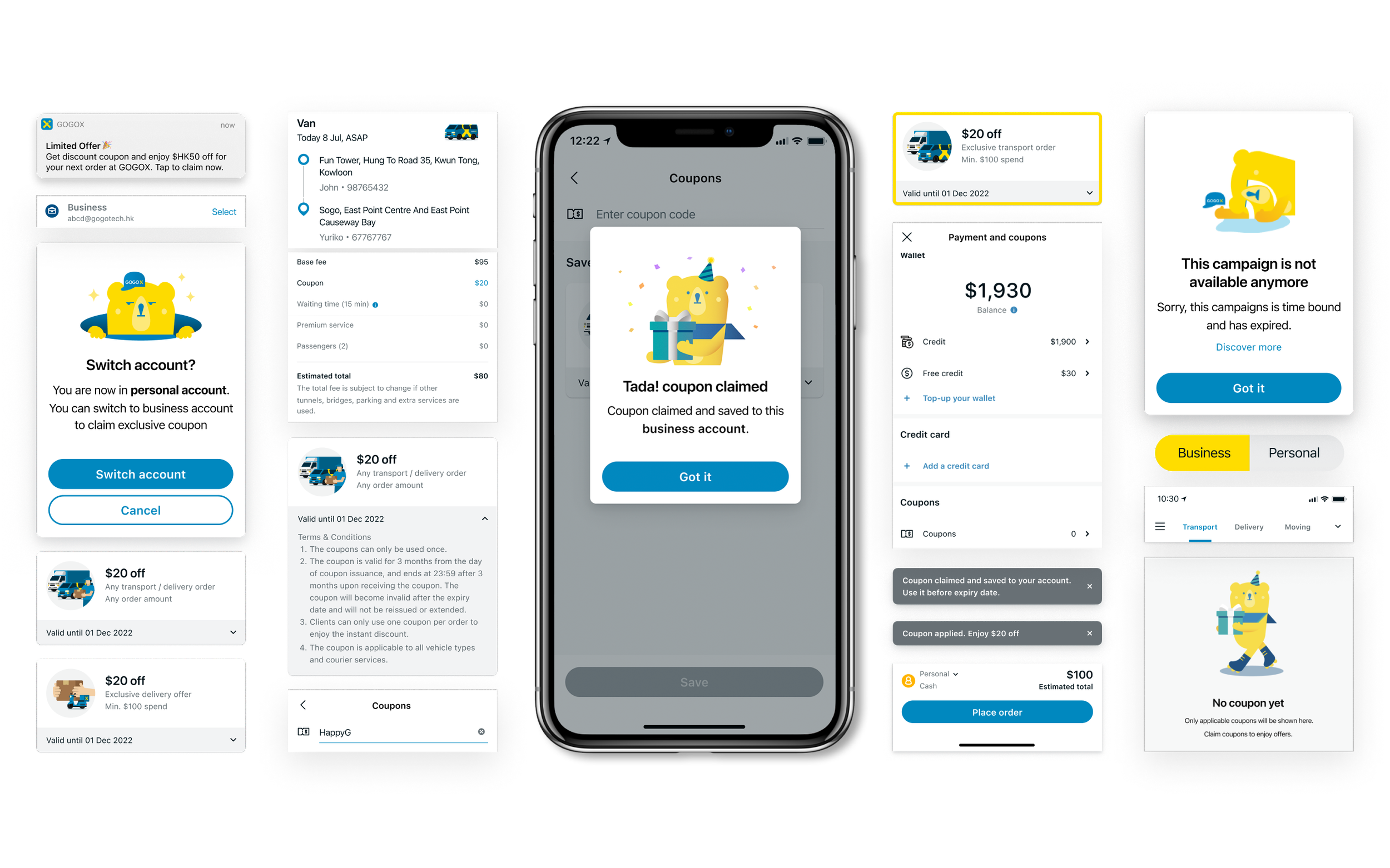
A streamline redemption experience with a coupon system & hassle-free interface
Detect account
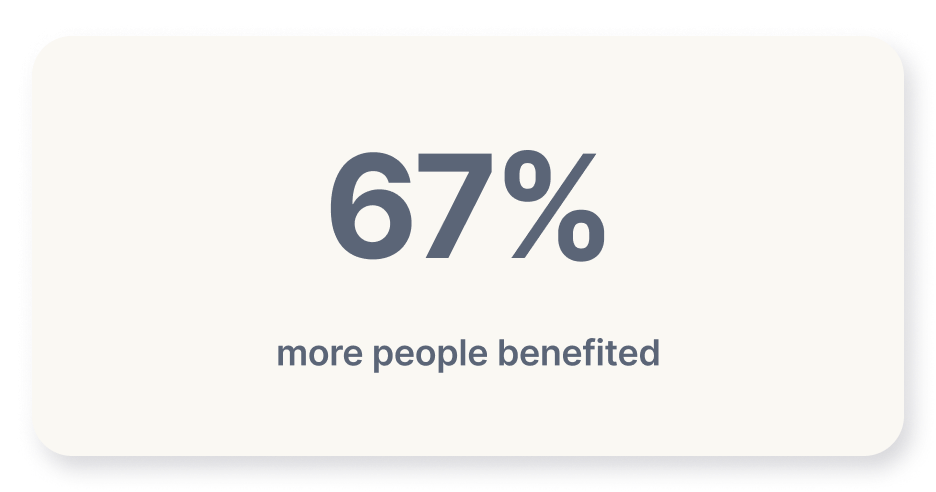
More customers can enjoy deals with just 1-click
Direct redeem
Apply discounts to any order 3x times faster
Auto-saving coupon wallet
Save money on all types of orders
Impact
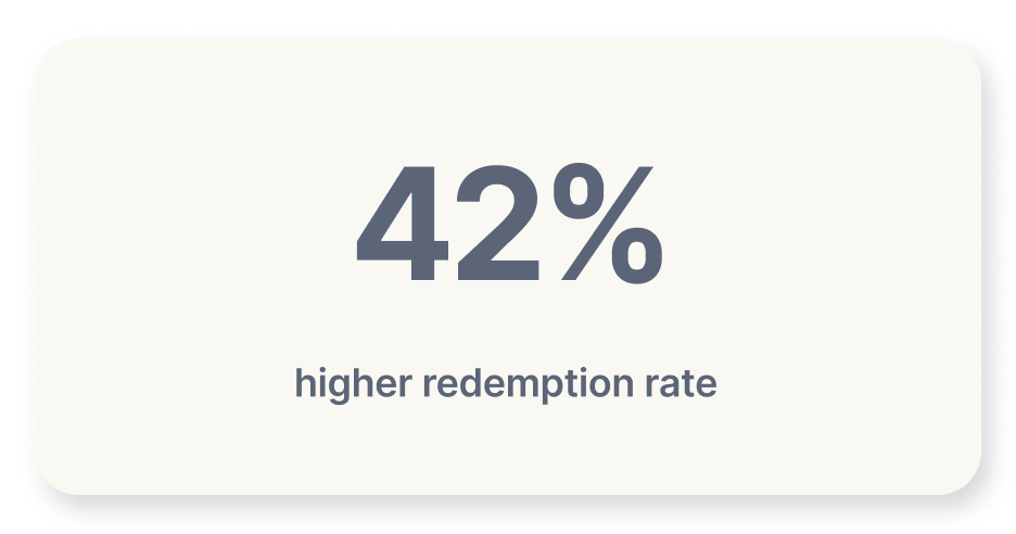
The designs have increased retention rate by 4%
These designs are flexible & intuitive for all customers and scalable for creating a loyalty program across multiple markets in the coming phase.
How did we get there? Let’s revisit the process…
01. Empathy
・Understand why customers leave and clarify internal needs
・Consolidate internal needs with cross-functional teams
02. Define
・Discuss and reach a consensus through workshops
・Define the goal for V.1 of the product
05. Develop & Release
・Launch V.1 for all types of customers on iOS & Android
03. Prototype
・Build prototypes for design critique and engineer review
・Discuss system structure of with engineers and test with marketers
06. Reflect
・After 3 months, analyze the patterns
04. Ideate
・Run user testing, internal evaluation, and ideate design
Empathy
To validate the problem, I tested the existing app with users & interviewed experts (marketing team & business operation).
Due to the time constrains, I also studied research reports to uncover the reasons why customers leave GoGoX and how to stop them leaving from a loyalty perspective.
Key customers pain points
Lack of information
"It's hard to figure out when the deals expire and which services they apply to. I'm not sure if I qualify until I apply!"
Low discoverability
"It's frustrating to find the promo codes that I can apply; it’s all by chance."
Inconvenience
"Typing in the code manually is not efficient; I can't quickly apply the discount, especially when I'm in a rush."
I also initiated workshops with a cross-functional team (Marketing, Engineering, Product Managers, Data Analysts, and the Business team) to identify internal needs.
During the workshops, I clarified issues with marketers, consolidated business needs, shared competitor analysis insights, and proposed user flows.
🤯 The biggest challenge I faced was moving forward with design solutions while collaborating with a large group of stakeholders. To create clarity into my decision-making process with everyone, I set up 3 Design Principles
Efficient: Enable users to maximize benefits with minimal effort.
Intuitive: Make it fast and easy to use for everyone, everywhere.
Flexibility: Give users more control over their time and money.
👀 Visualise the end-to-end
I used experience mapping to visualise the user journey.
Mapping out users' emotions was key to setting stakeholder expectations about how users feel about the product.
⛳️ Starting at the end
The goal we aligned from the workshop was to build a loyalty program. However, after a thorough investigation, we found it is challenging to revamp the existing promo code due to technical debt. To address this, we need a scalable solution, and building a coupon system will be a good start.
Due to limitations in the legacy promo code system, building a coupon system will be a scalable solution.
Measuring success
Transaction count with coupon usage & number of coupons being saved
Define the system logic
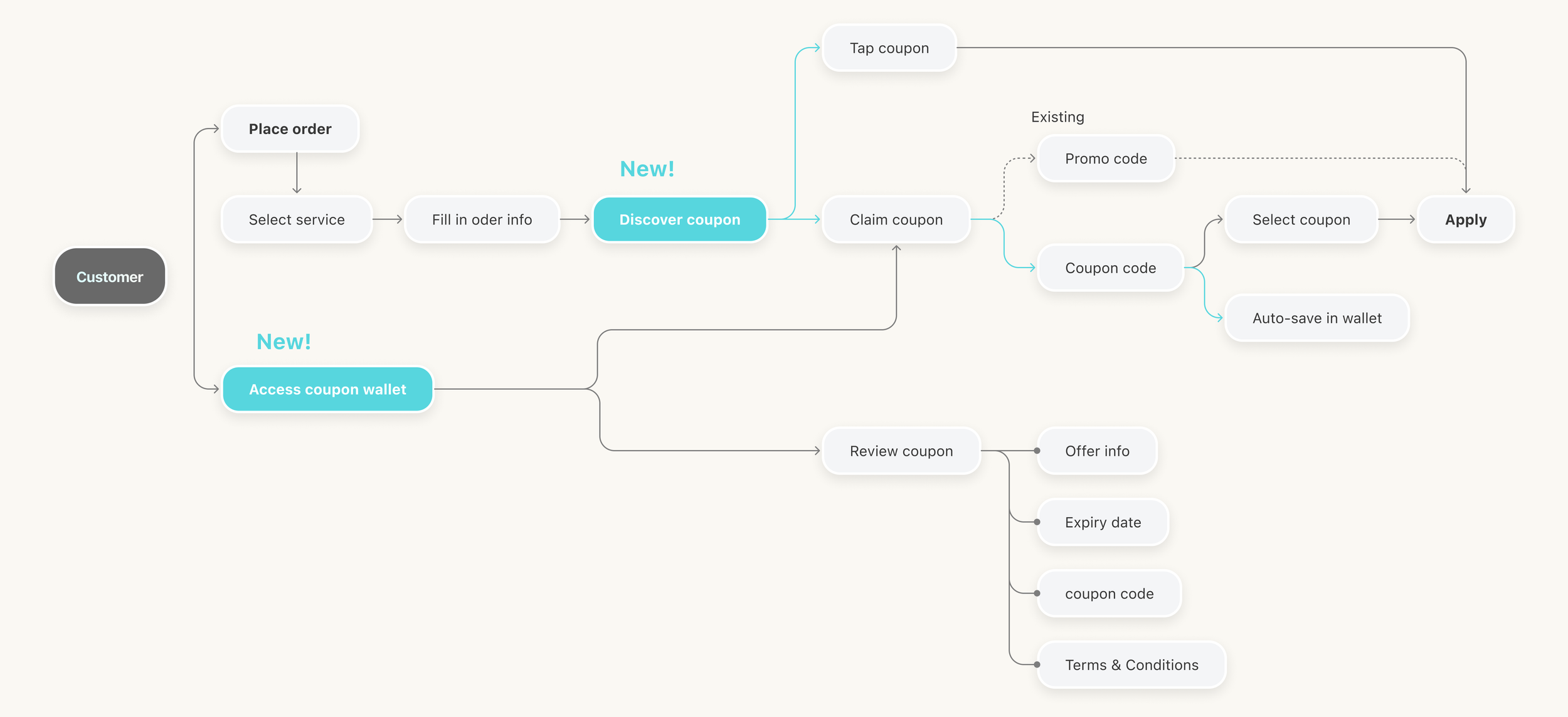
While focusing on a new coupon system, we realised we still needed the existing promo code system for ongoing campaigns. To integrate both systems seamlessly, I structured various touchpoints, guiding the team through the development process.
Prototype & Ideate
Validate design through rapid iteration
To iteratively refine the design, I initiated eight user testings and organised design reviews with four other designers to gather feedback on the prototype.
Challenge & Compromise
Weighing the design tradeoffs
During the design process, the engineers informed me that their initial estimation of the implementation time might have been too optimistic. To deliver value to users, I led a two-phase strategy. Not ideal, but the best choice to align with the marketing plan for an on-time launch.
Strategic phase 1 of 2
Establish Coupon Experience
To launch on time, I identified three key areas to focus on: Structure, Scoping, and Interaction, and iterated design based on user feedback.
1. Structure
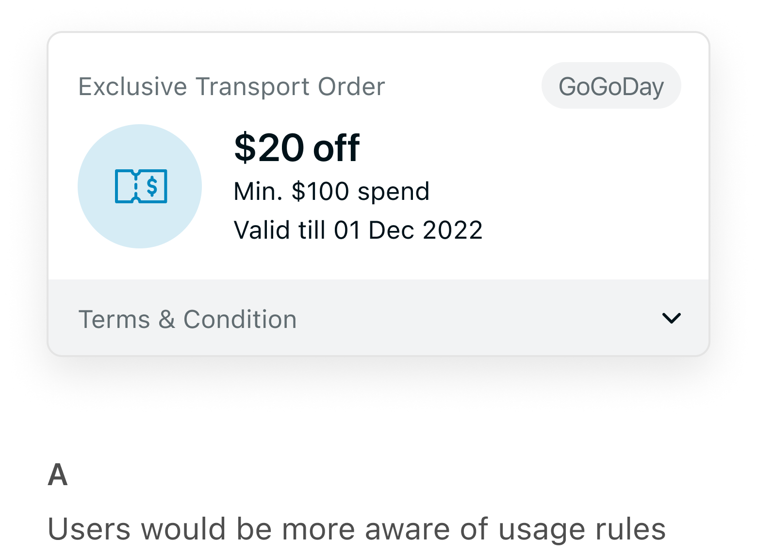
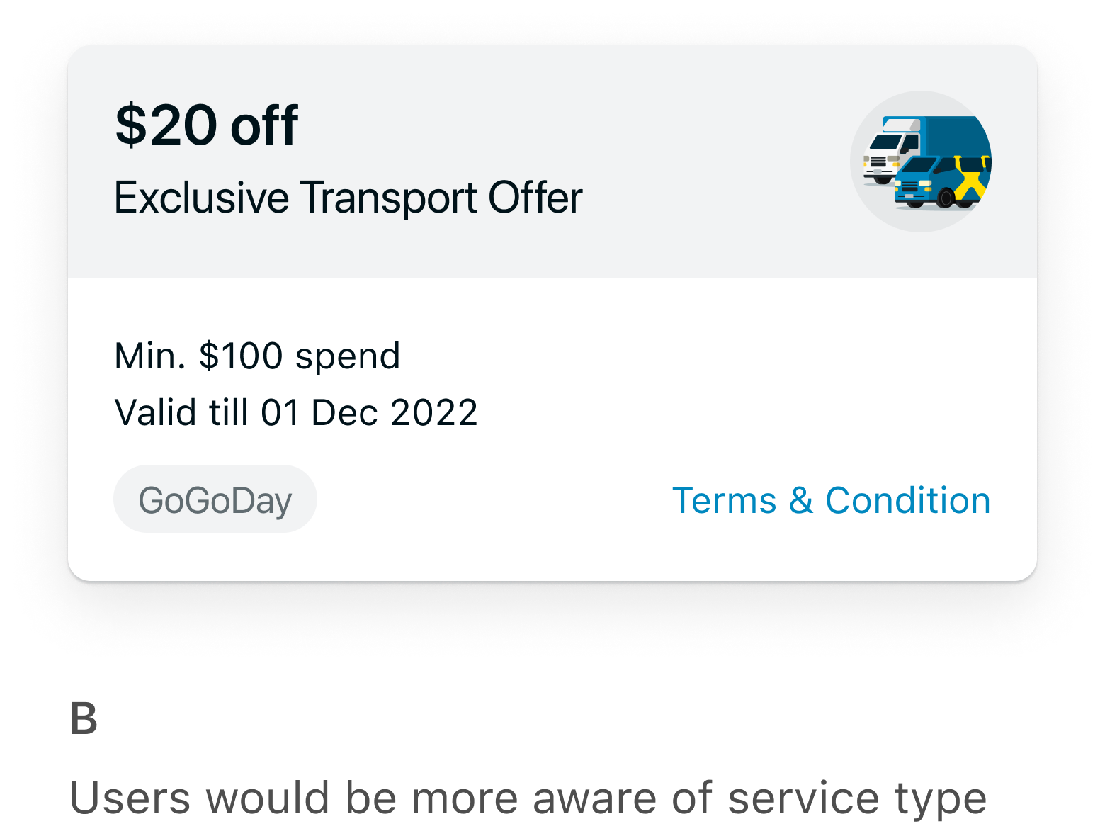
The Coupon cards display all the campaign related information. I prototyped two options to explore how users perceive the coupons.
🕵🏻♀️ Findings from user testing
Users preferred seeing the coupon price and rules together for quick decisions. Despite our rebranding, some still associate us only with van-hailing, unaware of our expanded services. Concerns include the unnoticed expiry date, and users tend to proceed without reviewing terms.
🎯 Action item
Based on user feedback, we combined ideas from options A&B.
We adopted the hierarchy from A for users to scan price and rules together, used a service illustration similar to B to highlight various services and boost brand awareness, and placed the expiry date in a tappable area, serving as a visual cue to encourage users to read more.
2. Scoping
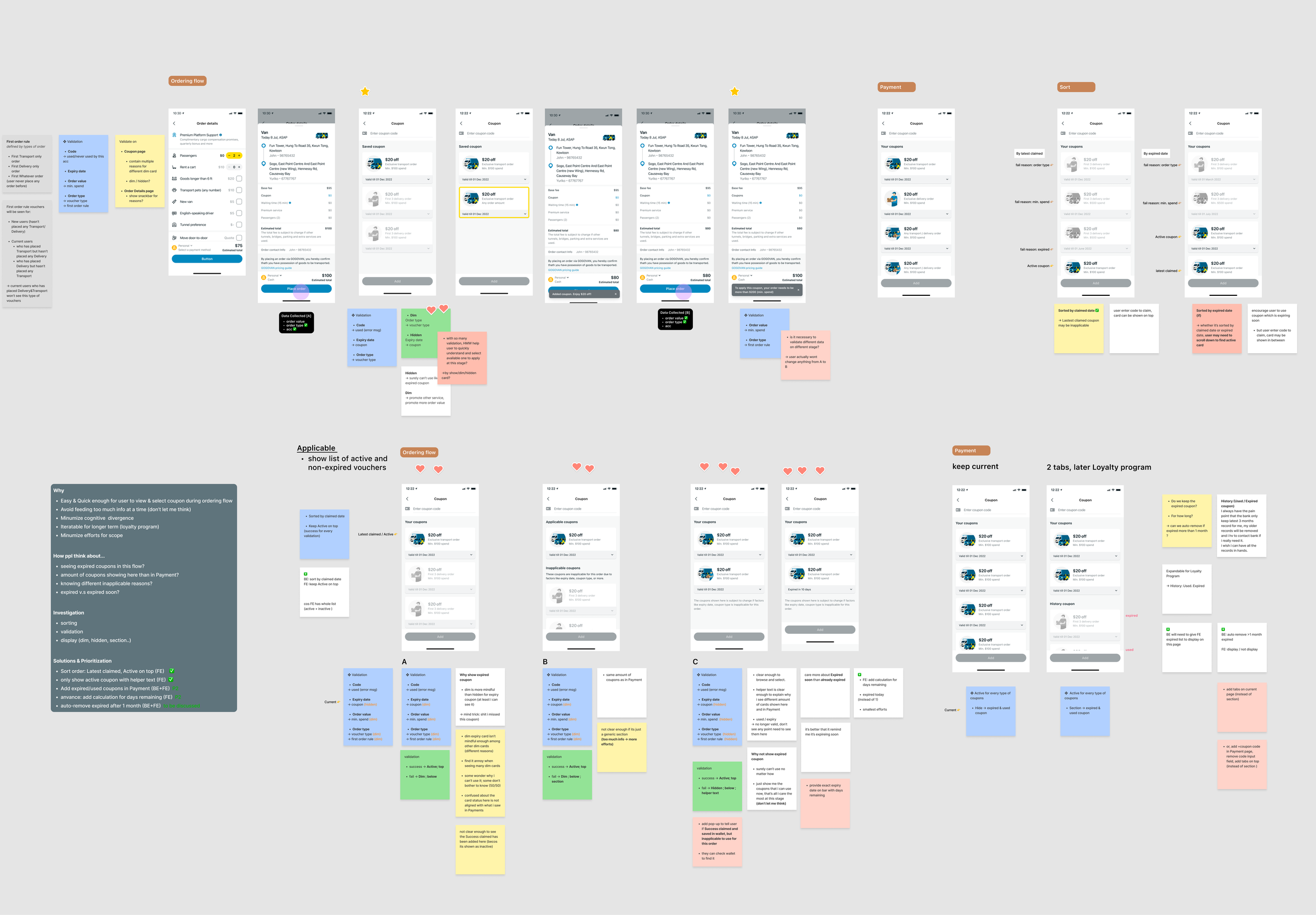
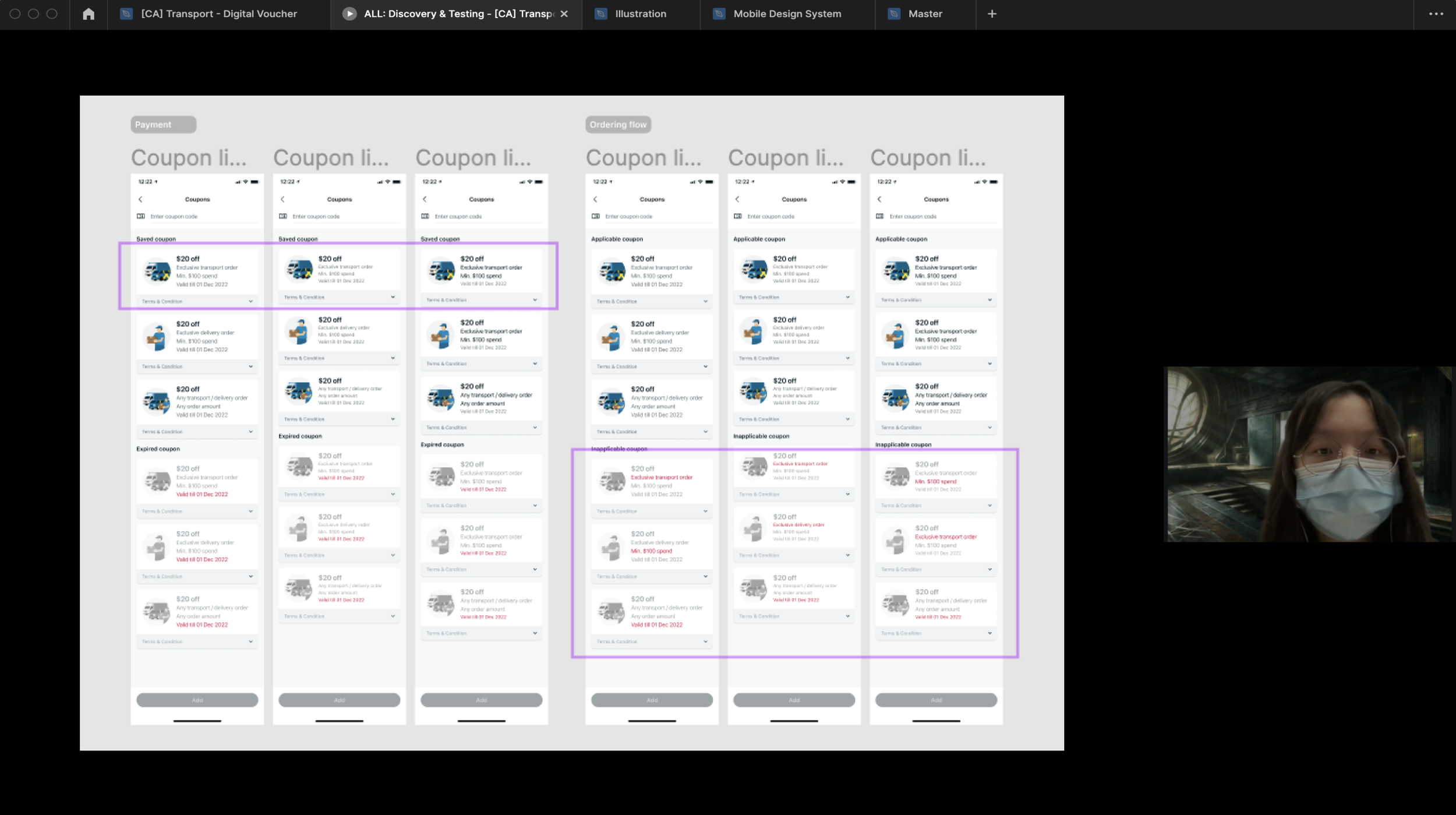
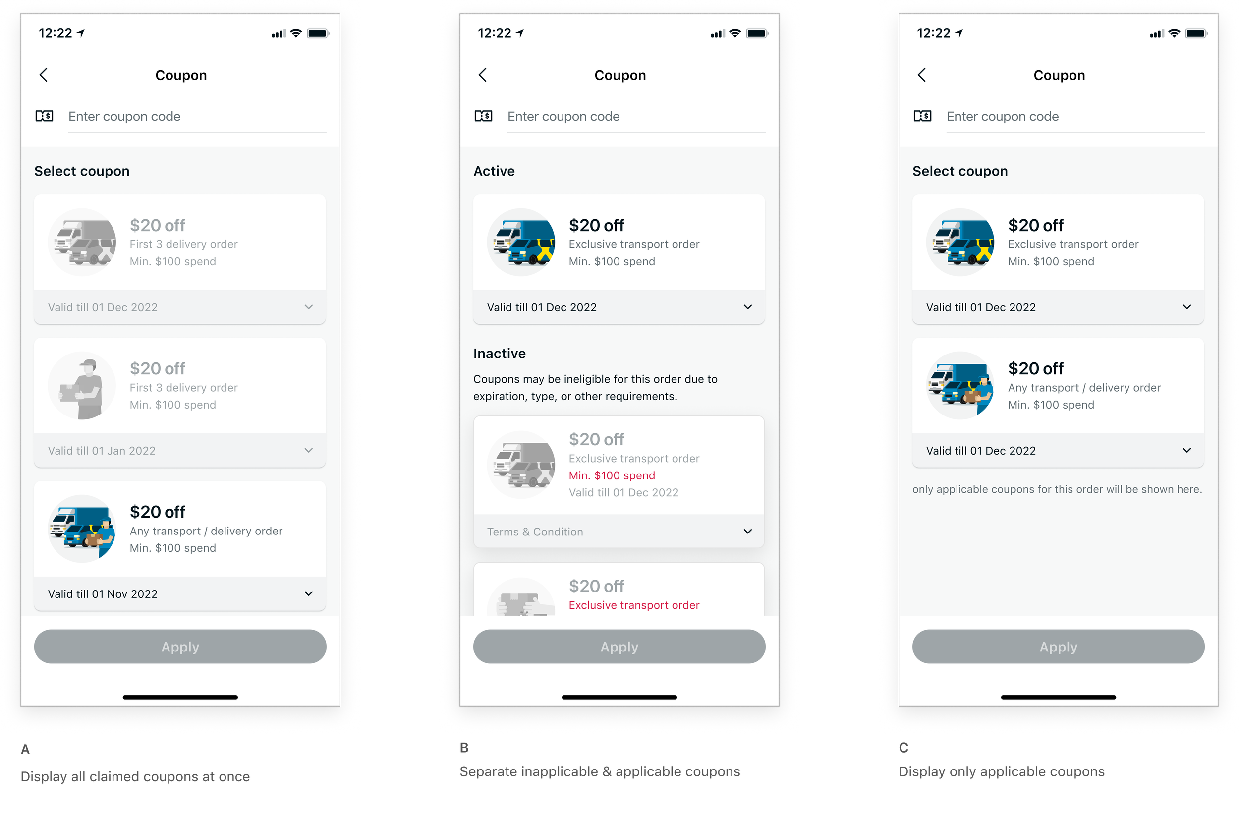
Coupon page is where users can apply or claim coupon. I prototyped three options to understand the user's mental model when selecting a coupon.
🕵🏻♀️ Findings from user testing
Usability tests on this page revealed that users were confused by inactive coupons. They prefer a more straightforward way to select coupons applicable to their orders.
⚖️ Tradeoffs
Displaying all claimed coupons allows users to plan ahead or keep track of expired ones. However, browsing inactive coupons is not only time-consuming but also has not yet proven to be valuable.
🎯 Action item
After thorough evaluation, we decided not to show inactive coupons in this phase and proceeded with the option C to prevent information overload.
3. Interaction
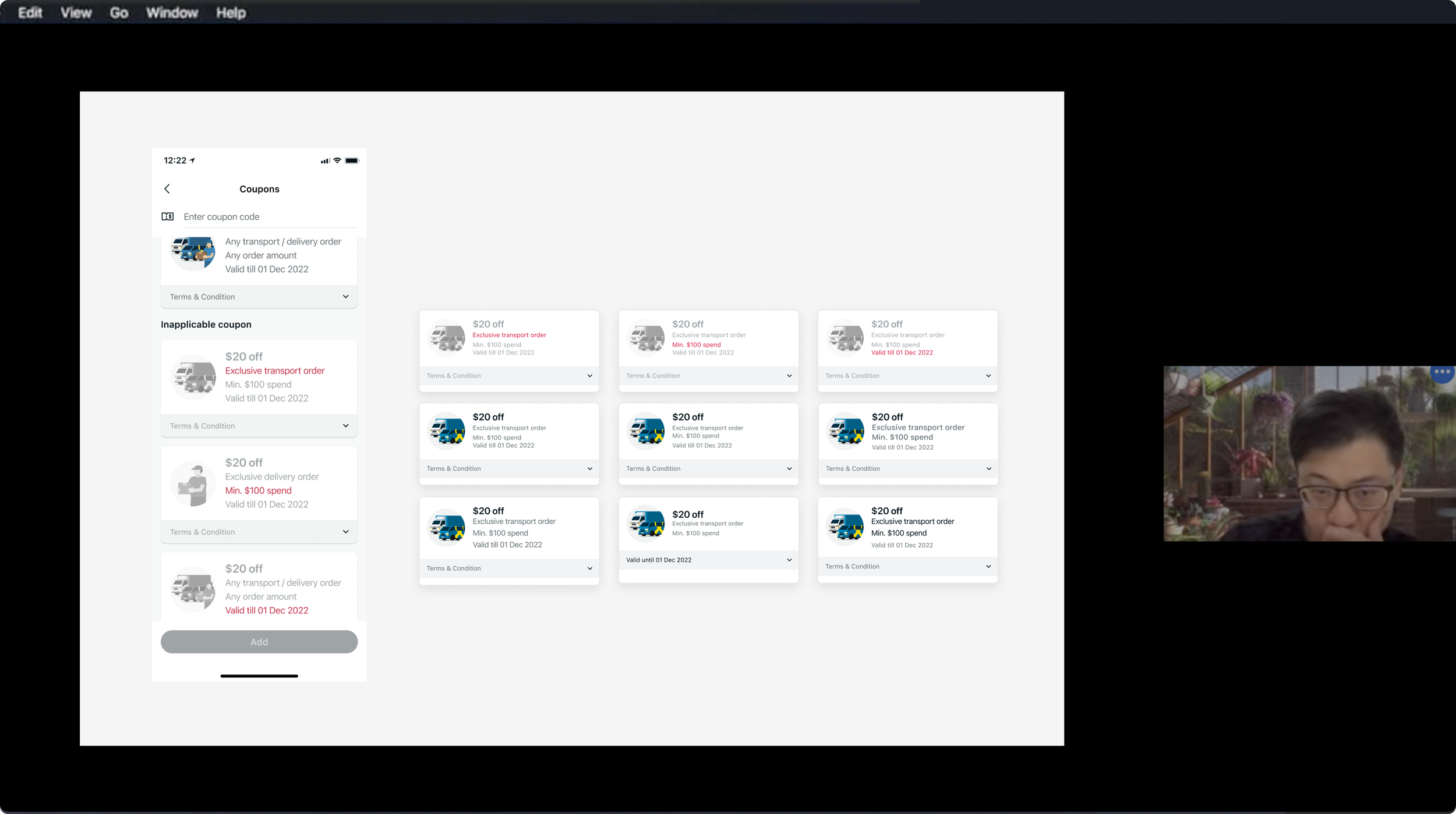
To launch in different countries, it was crucial for the coupon to be adaptable to various regions and potential regulatory challenges. I worked closely with the marketing team to understand what content they would need to localize and which components need to be dynamic.
🎯 Action item
To address this, I conducted thumb zone testing to define the tappable area and prototyped an expandable card to demo how users would interact with it.
Additionally, I collaborated with engineers to implement variable text for term details, helping marketers manage each coupon with ease.
Strategic phase 2 of 2
Streamline Redemption Process
After implementing the coupon system, there are still 2 problem areas we want to address:
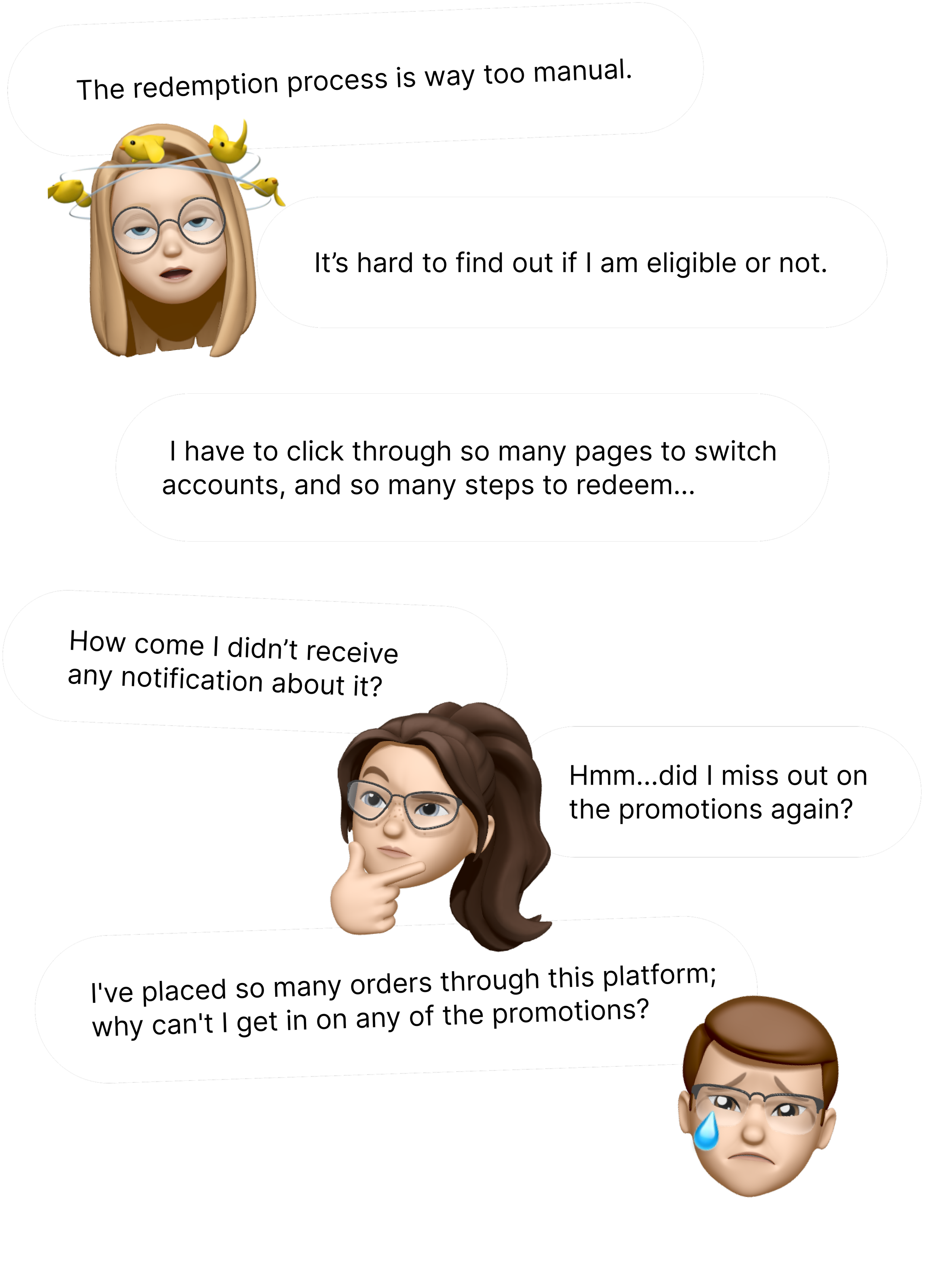
🫠 Manual redemption
The current coupon redemption process only allows users to manually input the coupon code, which is inefficient and prone to human errors.
😵 Low discoverability
Due to limitations in the current system, users couldn't receive notifications and felt they missed out on opportunities.
To address this, we needed to integrate our system with another 3rd-party platform and manage different validations.
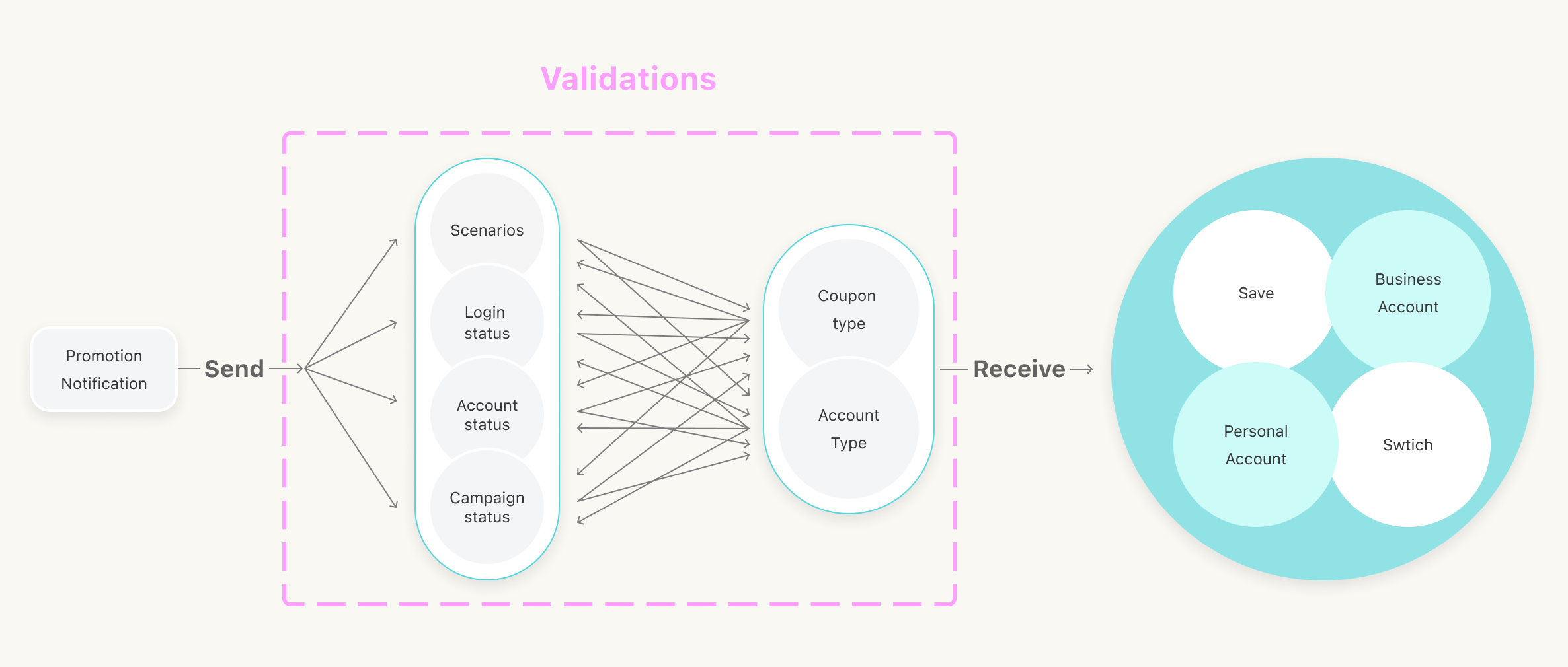
Collaborate with engineers and marketers to streamline the validation process, ensuring it can handle various scenarios
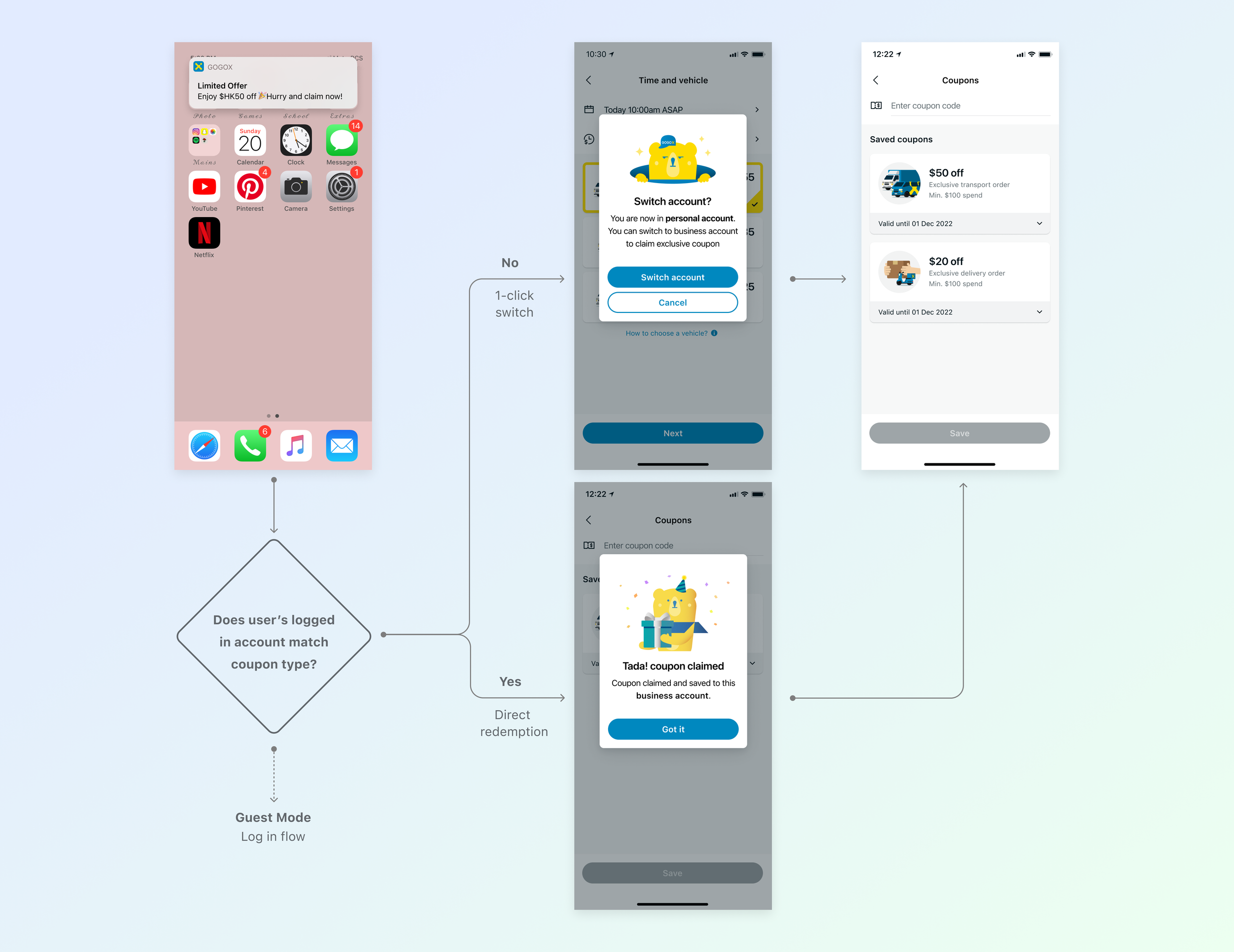
To guide my team through the complex validation process, I created user flows to outline different use cases and scenarios.
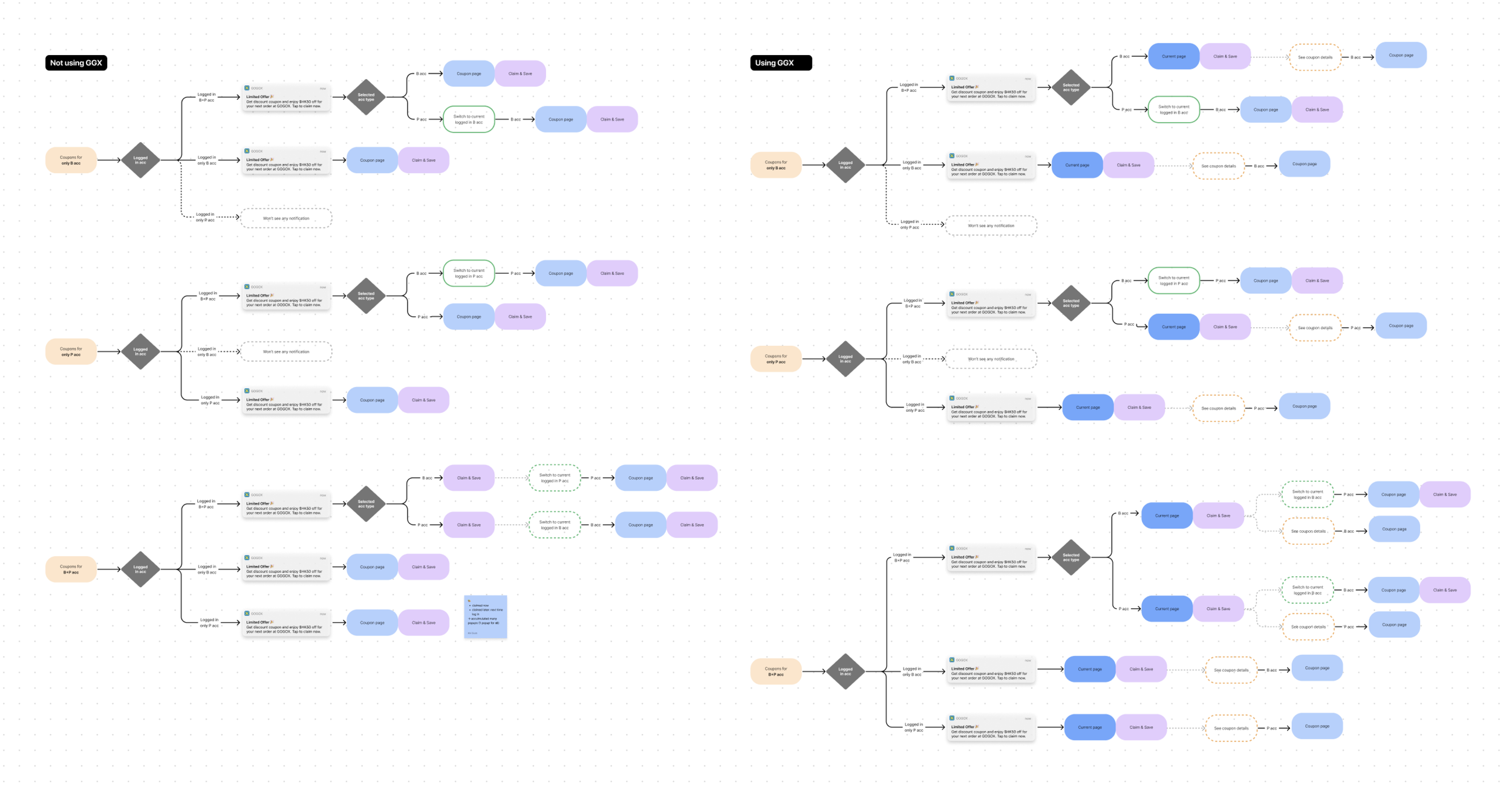
This provided visual guidance for us to communicate the experience, especially when working with different stakeholders.
Lead multiple interviews and identify the key changes for the next design iteration based on user insights.
Iteration 2.0
1-click redemption
UX testing (8 participants)
Before
Missing notification & unnecessary steps.
After
Enable all types of users to get notification & auto-save coupons with less effort.
Iteration 3.0
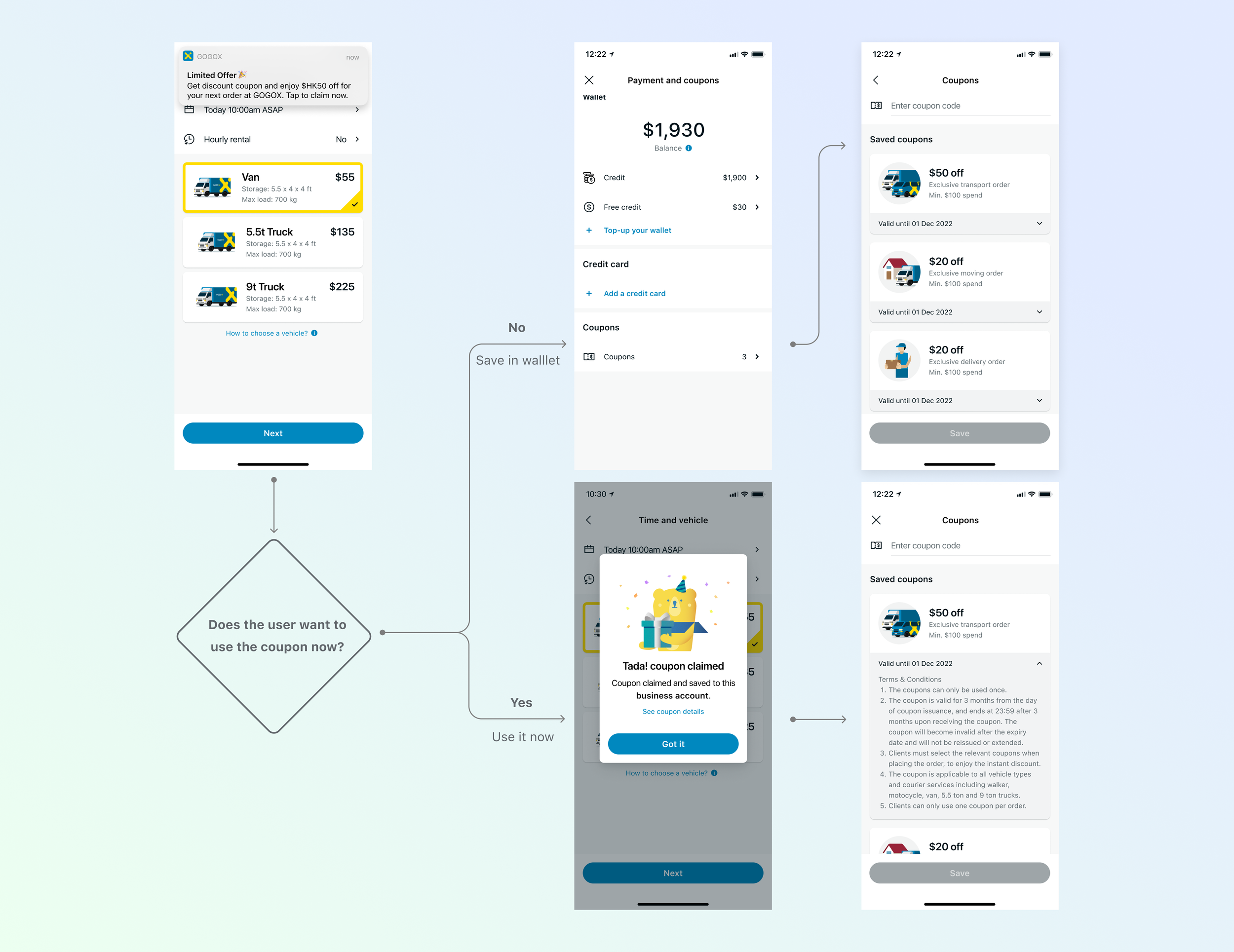
Keep coupons all in one place
UX testing (5 participants)
Before
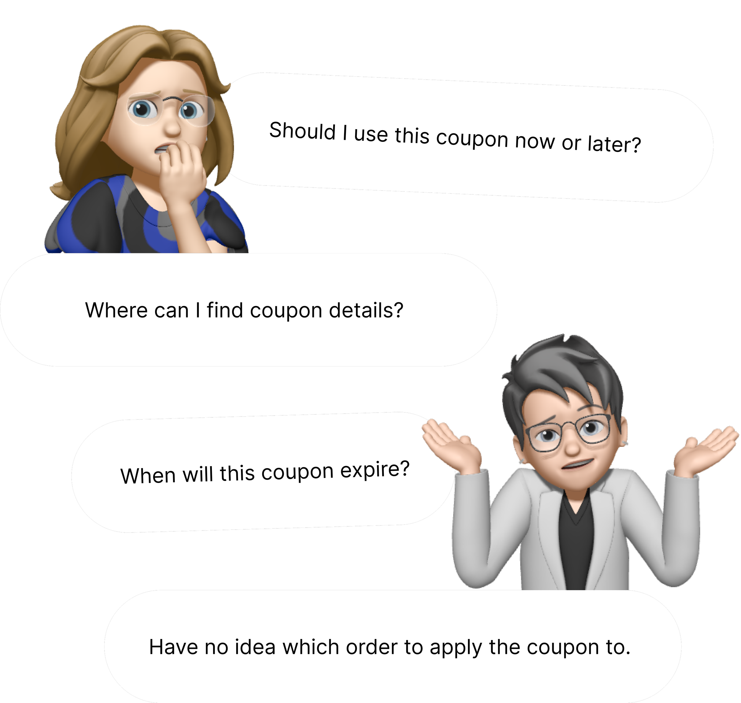
No centralised place for users to browse coupons information.
After
Auto-save coupons in the wallet & allow users to plan ahead and utilize coupons for their orders at any time.

Reflection & Learning
Effective communication
While collaborating with cross-functional teams under resource constraints, I've learned to maintain open and clear communication channels with stakeholders. This ensures alignment on shared goals and enables strategic decisions to maximize impact with the available resources.

